10 Top New Free Fonts for 2014

|
|
Quality fonts are hard to find in the mass of fonts available on the internet today. But no worries! We are here to save your day.
In this article are 10 great fonts that are all unique and great in their own little ways. Check them out and who knows, maybe you’ll probably find that one font you’ve long been looking for.
Arenq
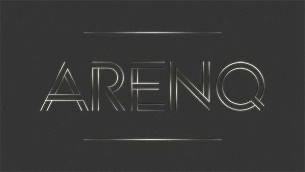
The letters in this typeface are composed of clean lines, open shapes and the concept of closure. You can easily imagine this font on neon signs because of the linear properties it possesses.
Hallo Sans
Instead of using straight lines, the designer of this typeface opted using curved ones instead. The curvilinear structure of this typeface is both modern and elegant to look at.
Margot
The subtleties in the structure of Margot makes this typeface a very likeable one. The subtle indentations and rounded corners are the secret to the great look of Margot.
Redressed
The brush-like strokes that the letters in this typeface are made of are what makes this typeface elegant. It is simple, elegant, clean and more importantly, appealing.
Bebas Neue
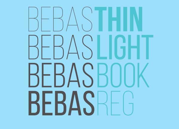
Based on the original Bebas Neue free font created by Ryoichi Tsunekawa, Bebas Neue is a sans serif font family that has become widely popular. It now comes with four new weights: thin, light, book and regular. This typeface has professionalism written all over it– wouldn’t you agree?
Adam

One glance at this font and you will definitely think “modern”. The clean lines and semi-bold weight that Adam carries makes this typeface a versatile one that could be used for a variety of occasions.
Odin Rounded
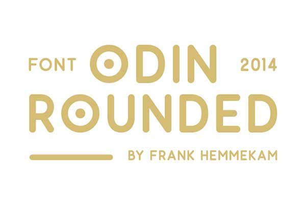
The clean and linear appearance that Odin gives off will go great with your next project. Designed by Frank Hemmekam, the simple compact nature of its design and the many alternatives available make this typeface a viable candidate for your next project.
Asfalto
One look at Asfalto and you’ll be able to appreciate its cleanliness and state of distress as well. The combination of the two is what makes this typeface a great one. It is distressed enough to make it look different and clean enough that it is readable.
Falling
Something interesting about this font is that it gives closure design a whole new meaning. Somehow, we are all still able to read what it says and it is different enough to make it stand out in your project.
Mohave
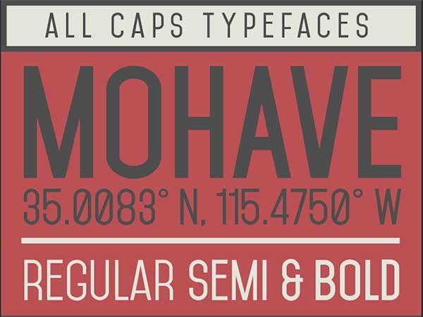
Mohave is an all-caps display typeface, free and designed for large points settings. It comes in three weights: regular, semi-bold, and bold italic. Its new version comes with improved glyph shapes.
They’re not your usual typefaces but they will give your project a nice new twist. Download one now and see for yourself!


